Logo Usage
This page provides a set of rules, which you must strictly follow so that it maintains its integrity and can be reproduced correctly in any situation.
Here is a logo gradation applied in grayscale, to give the correct perception of how to use the high contrast versions.
The basic principle is to maintain as much contrast as possible between the logo and the background.
The basic principle is to maintain as much contrast as possible between the logo and the background.
In case you can't apply the logo on the primary colors of the brand, here are some guide examples that show how you can preserve the logo visibility.
The basic principle is to maintain chromatic integrity with the maximum possible contrast between the logo and the background color.
The basic principle is to maintain chromatic integrity with the maximum possible contrast between the logo and the background color.
Whenever it is necessary to reproduce the logo on photographic backgrounds, its placement must fall on the image areas that allow a good reading.
The Devscope logo must maintain its integrity on any media used.
Here are some of the most frequent errors. They are prohibited in any situation.
Here are some of the most frequent errors. They are prohibited in any situation.

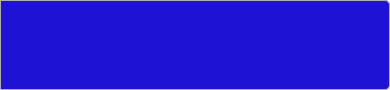
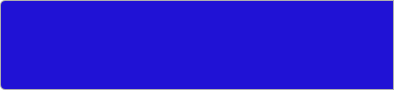
Selecting the right contrast
Logo application on colored backgrounds
Logo application on photographic backgrounds
These are FORBIDDEN!
Deforming the logo proportions
Changing the logo orientation
Using gradient fills on the logo
Using unspecified colors on the logo
Alter proportions between elements
Using the logo on top of images with insuficient contrast
Changing the logo font
Split up the logo
Minimum dimensions (for print)
To ensure legibility at different scales, we recommend you not to print the logo less than 20 mm wide.
20 mm


BRAND OVERVIEW
VISUAL STYLE GUIDE
RESOURCES
Logo
Philosophy
Colors
Typography
Safe Margins
Logo Usage
Writing Style
Media
Downloads